Conceptual Art Director › Project
Nanda-yo
Identity for a Japanese restaurant in Mexico City
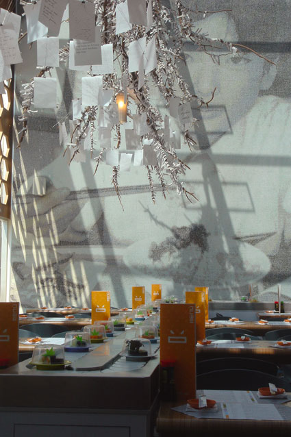
Nanda-yo means "what the fuck" in Japanese. The name comes from the interior, designed for Grupo MYT: Andrés Mier y Terán planted a tree covered in knotted papers, as at the entrance of temples, where ill-omened fortunes are tied so the wind carries the bad luck away. The whole identity starts from that fortune paper, the omikuji, which foretells love, travel and money. A conveyor-belt sushi restaurant where you never know what the belt will bring.

The logo
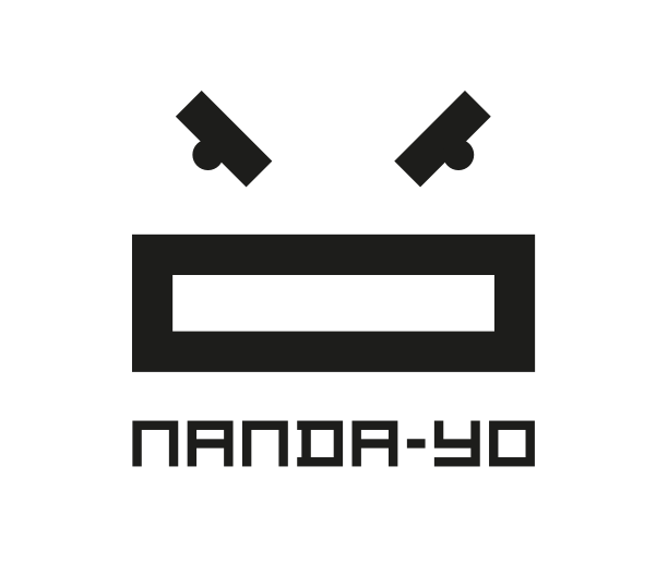
The logo is the bad omen in person: two eyes, a mouth, the face of the bad luck tied to the tree for the wind to carry off. A sign that grimaces, and changes expression with the fortune.
Visual identity
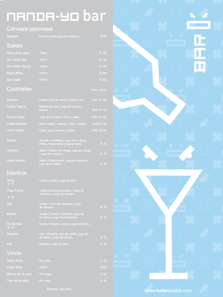
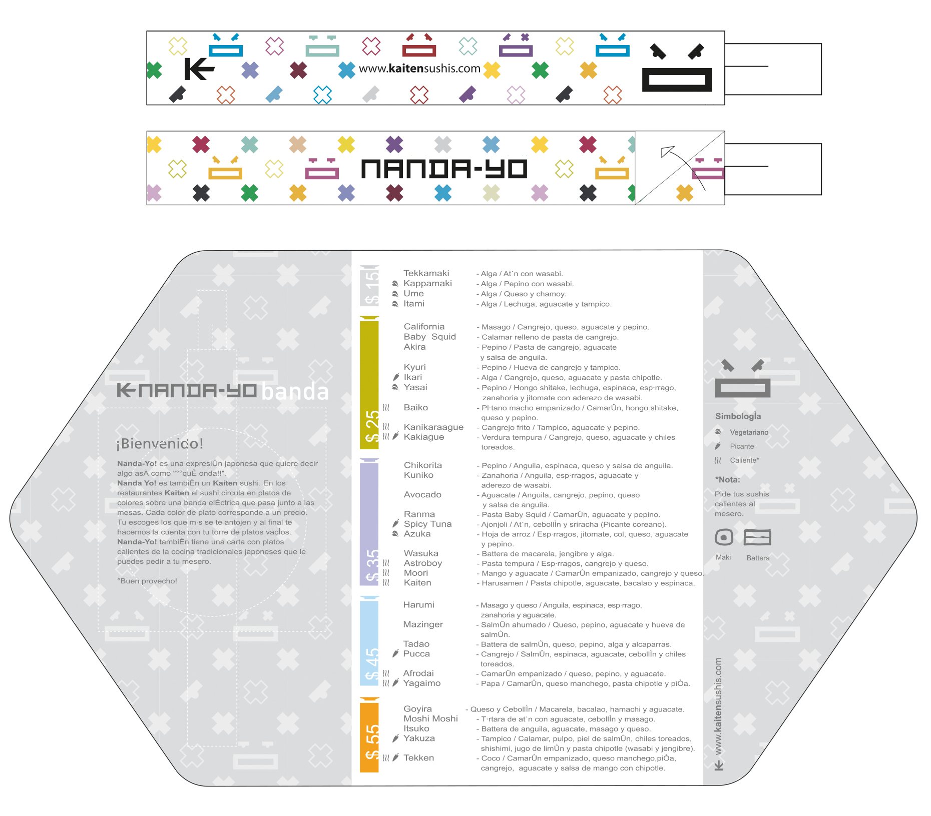
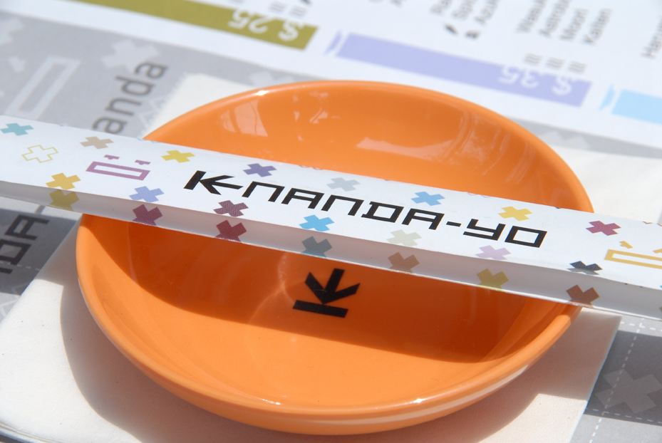
The face comes in several expressions, then repeats endlessly as an all-over pattern, like the monograms of luxury leather goods. The bad omen treated as the emblem of a great house: that is the whole joke of the place.
The beer mats
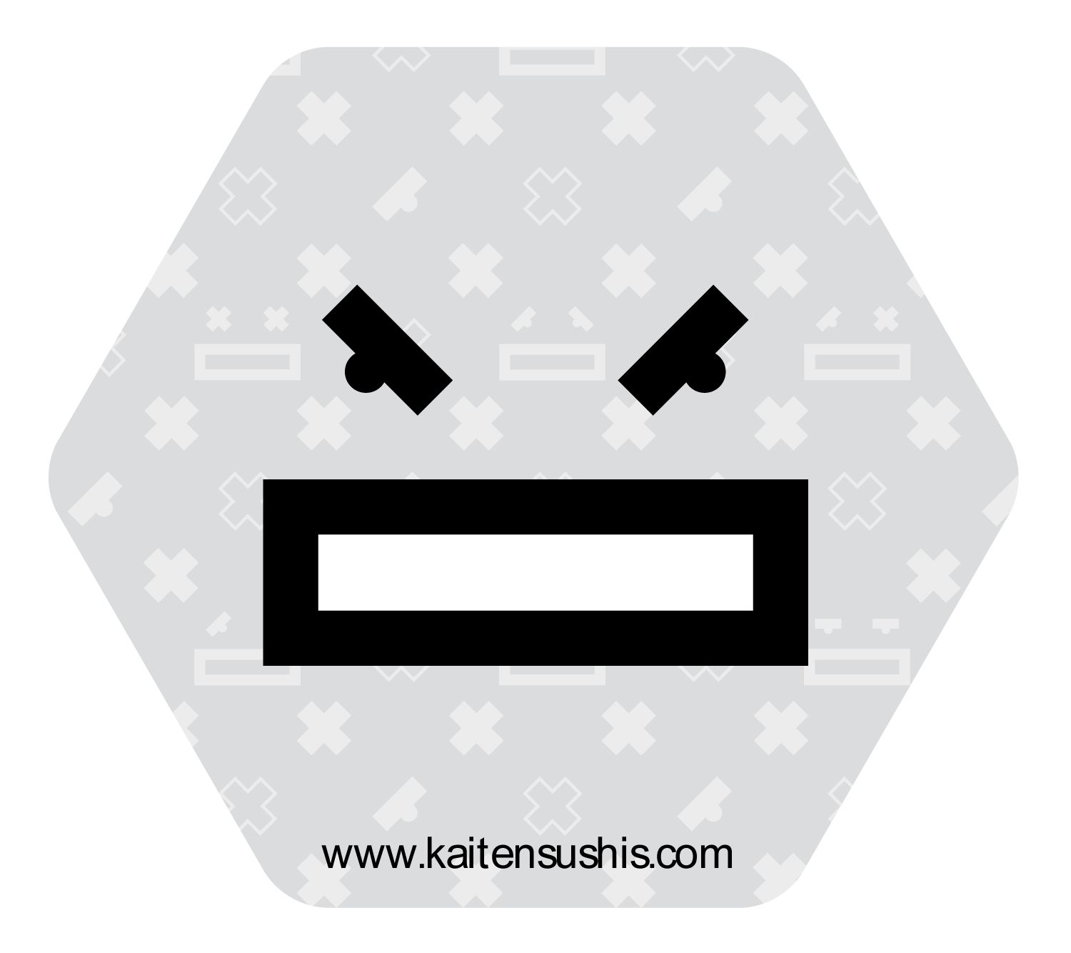
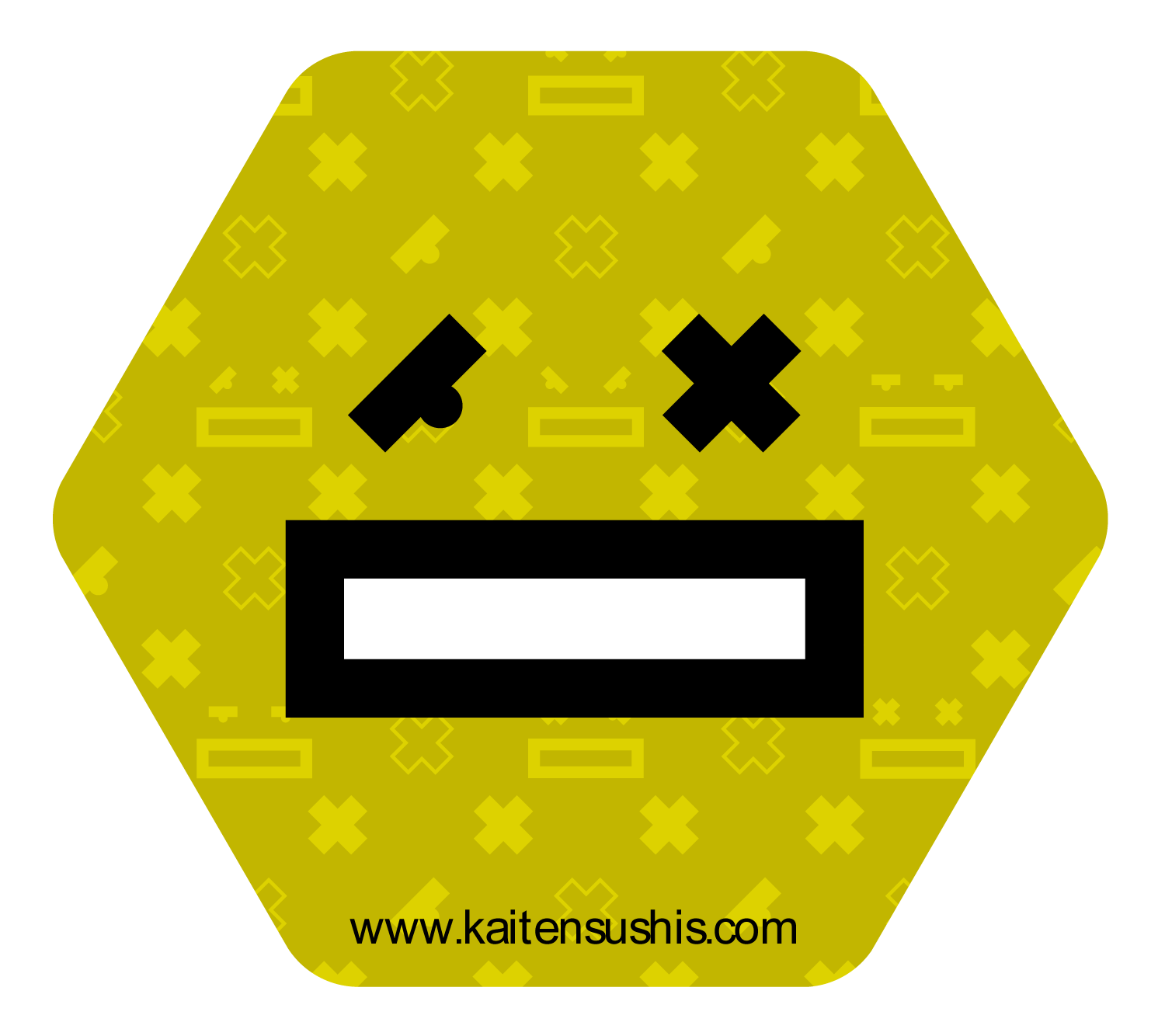
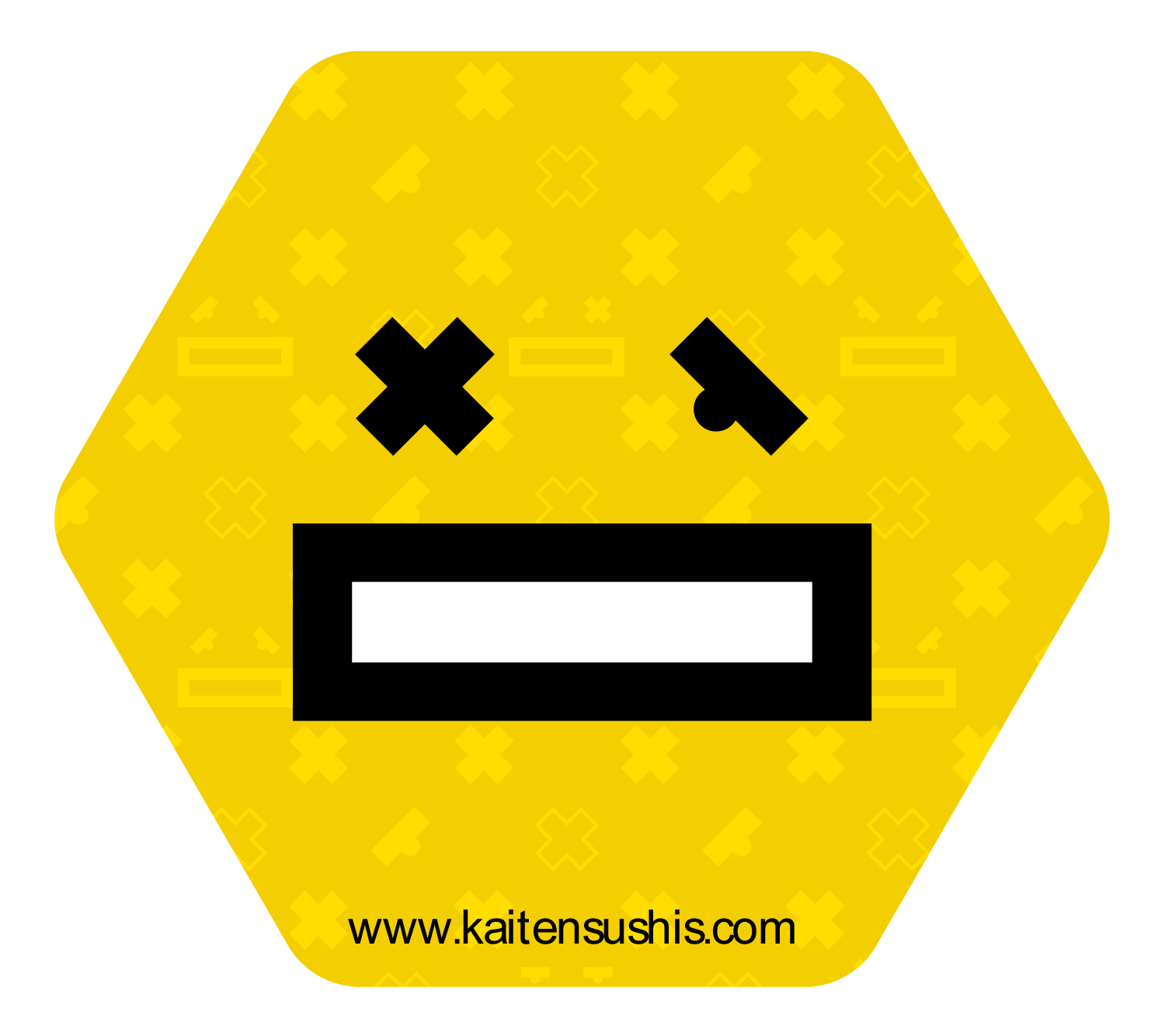
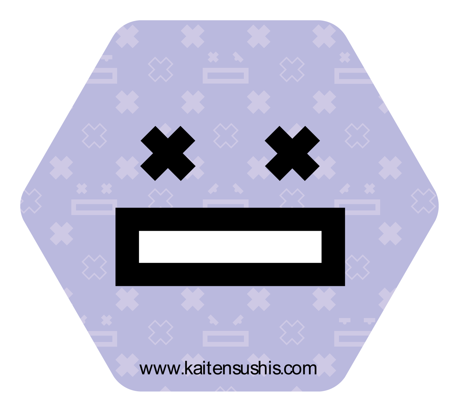
A distinctive feature of the restaurant: each table has its own beer tap. Six beer mats were designed, each reinterpreting the logo through a different omikuji-inspired expression.


See the portfolio
Open this project in the portfolio, with all the visuals and animations.