Conceptual Art Director › Project
Chefs & Prestiges
Logo for a private chef service
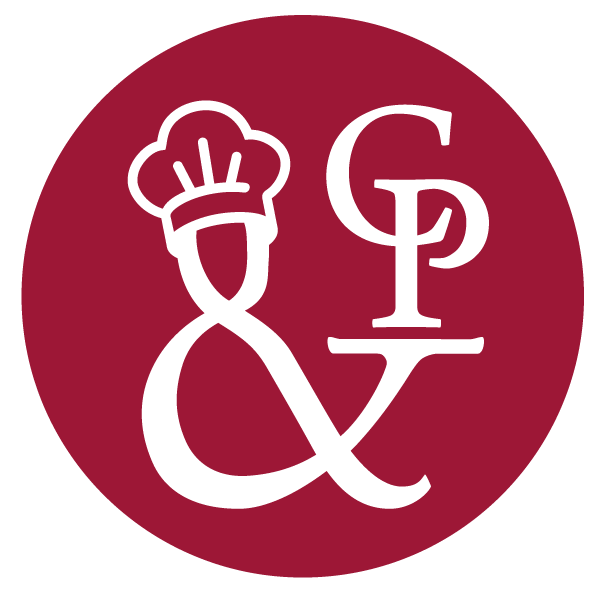
Logo design for Chefs & Prestiges, a service that brings top chefs out of their restaurants to cook at private events (weddings, receptions). The visual concept is built around a redrawn ampersand (&) that takes on a human shape: the chef himself, recognisable by his toque, holding a serving platter. In a single repurposed typographic symbol, the logo says it all: the chef, the service, and the connection between them.
Visit the website ↗
The logo
The ampersand came quickly: redrawn, it becomes the chef himself, toque on top, tray at the end of the arm. The work then went into the shape of the sign, until it could stand on its own, as a C&P monogram as well as in the full name. One variant sets a star on the tray, for Michelin-starred chefs.
Sketches
The chef-ampersand is there from the first sheets. The rest of the sketches look for the right line: the balance between the C, the P and the sign that joins them.
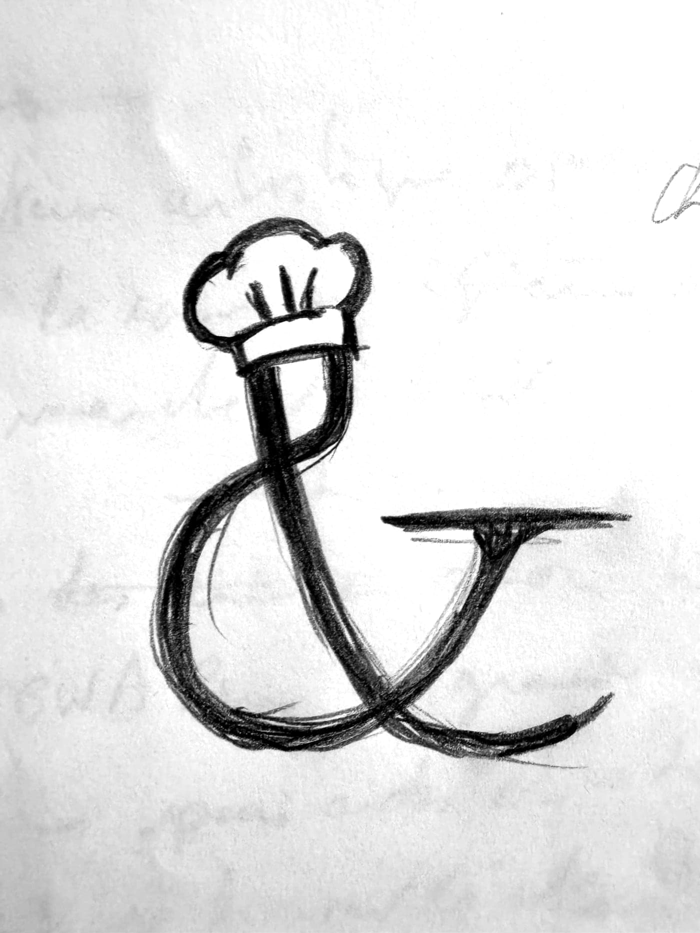
The idea, almost at once: the ampersand becomes a chef, toque and tray.

The website
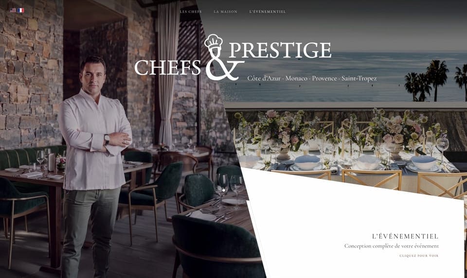
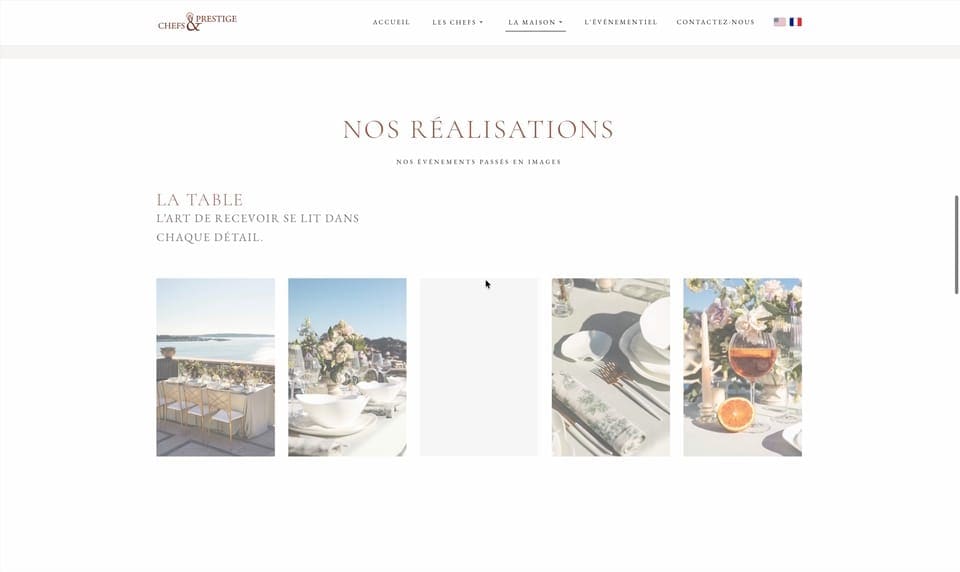
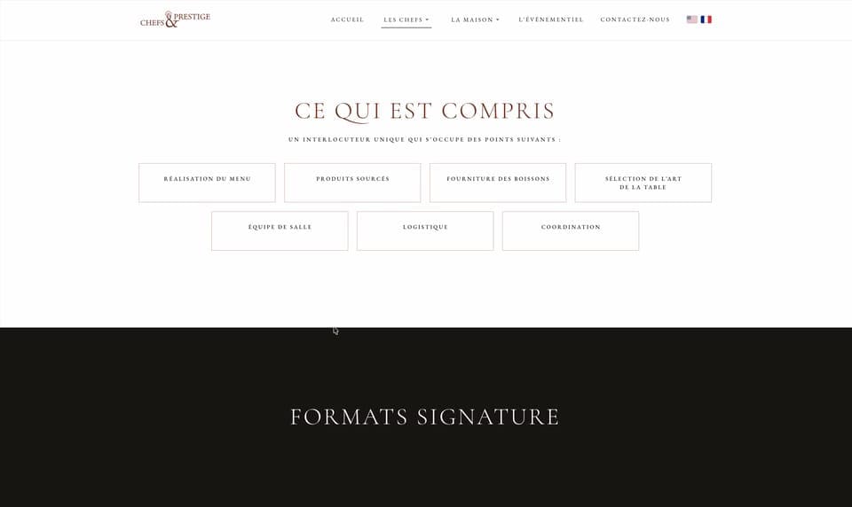
The website takes the mark and unfolds it, with the ampersand as a watermark, the logo's burgundy, and photographs that hold the full width. The page reads like a menu, from the chef to the reception formats.
Three moments of the page, the opening, the concept and past events, then the reception formats.
See the portfolio
Open this project in the portfolio, with all the visuals and animations.